Gridlex is a library to make creating building grid layouts easier. Normally to create grids (ie three column grid, 4 column grid), we would need to calculate the width + margin of every column width separately, write the css for it, etc.
Gridlex is a css stylesheet that someone has already written to make this process simpler, we just need to connect it to our site and reference the class names that it uses.
This video is taken from the Website in a Weekend Course.
To use any external library or resources, we start by adding it in the head. In codepen, this is in the settings.
<link rel="stylesheet" href="https://cdnjs.cloudflare.com/ajax/libs/gridlex/2.6.0/gridlex.min.css">
Then simplest way to create grids with gridlex is to add a class of grid to the container element and a class of col to all of the children
<div class="grid">
  <div class="col"> ... </div>
  <div class="col"> ... </div>
  <div class="col"> ... </div>
</div>
Introducing the 12 col grid
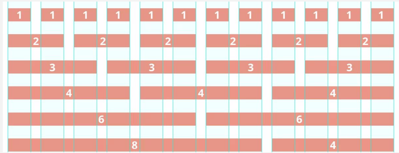
Web design often operates on either a 12 or a 16 column grid, where the page is divided up into twelfths and layouts are created based on how many 12th they take up. So half the page would be 12 / 2 = 6 columns. A third of the page would be 12 / 4 = 3 columns. A full page width always ads to 12.

Example: 2 column grid
<div class="grid">
  <div class="col-6"> ... </div>
  <div class="col-6"> ... </div>
</div>
Example: 3 column grid
<div class="grid">
 <div class="col-4"> ... </div>
 <div class="col-4"> ... </div>
 <div class="col-4"> ... </div>
</div>
Example: a 4 column grid
<div class="grid">
  <div class="col-3"> ... </div>
  <div class="col-3"> ... </div>
  <div class="col-3"> ... </div>
  <div class="col-3"> ... </div>
</div>
At first it seems confusing that to create three columns you use ‘col-4’ and to create 4 columns you use ‘col-3’ but after a while it becomes second nature.
Example: Mixed Columns
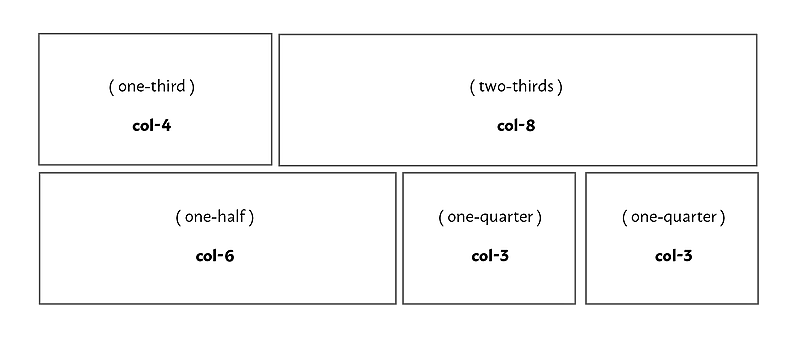
What about a container that looked like this?

<div class="grid">
  <div class="col-4"> ... </div>
  <div class="col-8"> ... </div>
  <div class="col-6"> ... </div>
  <div class="col-3"> ... </div>
  <div class="col-3"> ... </div>
</div>