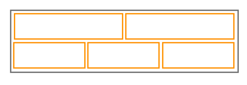
Your first challenge is to create this grid using gridlex, you can do it in codepen.
- It should be responsive and each column should ‘stack’ to 12-width on mobile.
- Don’t forget to add the gridlex code
- You’ll need to add some basic styles to all of your divs (like for example 1% padding and an orange border) so that you can see what you are doing.
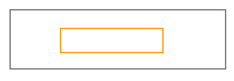
For your second challenge, you’re going to create a grid with only one column. We do this often for banners, because Gridlex allows us to easily vertically and horizontally center it’s contents – something we can’t do easily without it.
- set a minimum height of 100vh on the parent container (section perhaps)
- hint: the inner div might have a class like ‘col-6-middle’
Stuck? Send us a message and a link to your codepen and we’ll help you figure it out.