All GIFs in this article courtesy of Scott Domes.
The Flexible Box Model (aka Flexbox) is a set of css properties that allow you to create flexible layouts and grids easier than ever before (it became widely available in the end of 2016). With Flexbox, things that used to be really hard, like vertical centering, same-height columns, reordering and changing direction is now a breeze.
Flexbox is based on having a set of item elements within a container element.
The main idea behind the flexbox is to give the container the ability to alter its items’ width/height (and order) to best fill the available space (mostly to accommodate to all kind of display devices and screen sizes). A flex container expands items to fill available free space, or shrinks them to prevent overflow.
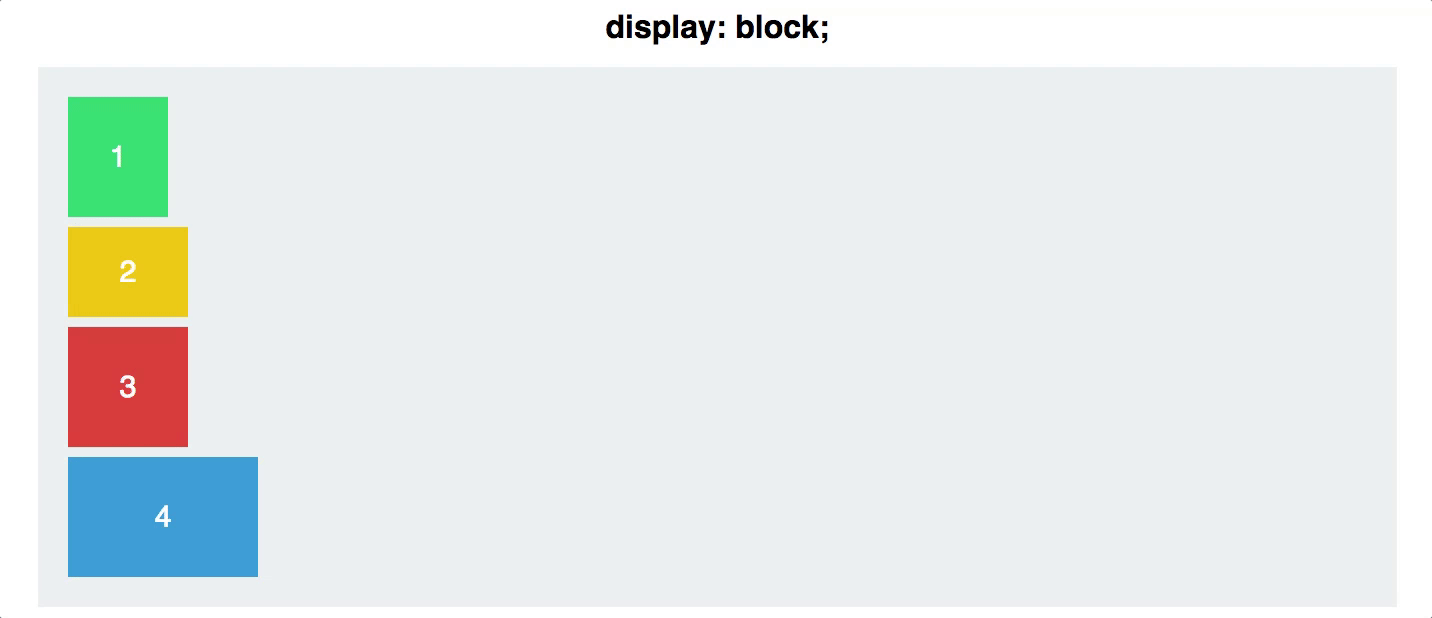
Let’s look at an example together. Here we have a grey container div, and 4 divs inside. Even when we set the width of the colourful divs, they still take up the fill line, as block elements do.
Property #1 - Display Flex
Then as soon as we set the display property of the parent container to flex, they line up next to each other.
<section class="container">
    <div class="green"> 1 </div>
    <div class="yellow"> 2 </div>
    <div class="red"> 3 </div>
    <div class="blue"> 4 </div>
</section>
(Obviously there would be additional CSS to control the width and colors, but we assume you’ve got that by now!).
.container {
    display: flex;
}
Pretty easy huh?
Property # 2 - Flex Direction
The next property is the flex-direction, previous to flexbox it was very difficult to dynamically arrange content on the page, and this becomes very handy later in responsive design. Don’t worry too much about how you would use this, just know that it exists.
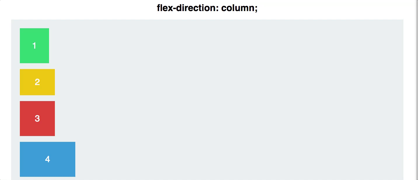
The default option is row, and the other options are row-reverse, column, and column-reverse. Again this is applied to the container element and impacts all of the child elements.
Property #3: Justify Content
Justify-content controls how you align the items along the main axis (which could be vertical or horizontal depending on the flex-direction). There are 5 values available to justify-content:
- Flex-start
- Flex-end
- Center
- Space-between
- Space-around

Property #4 - Align Items
Following along so far? Where justify-content controls the alignment along the main axis (typically horizontally) then align items controls the alignment along the cross axis (typically vertically). There are 5 align-items values;
- Flex-start
- Flex-end
- Center
- Stretch
- Baseline
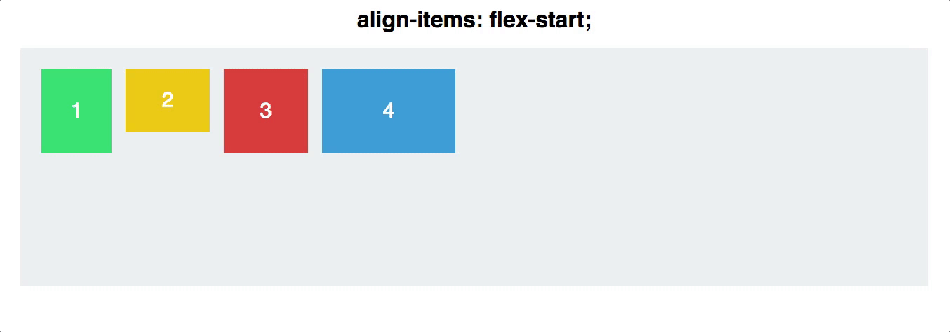
The first three are exactly the same as justify-content, so they are typically the easiest to understand. Stretch stretches the height of those items to fill their container (so long as their individual height it set to auto). Now for those of you just starting out this doesn’t sound to exciting but for anyone who has been in the web development world for a while the ability to easily create equal height columns is a HUGE deal. While it’s easy to set width: 100%, setting the height: 100% doesn’t work, so flexbox introduces the first way to have dynamic (they grow and shrink as the container does) equal height columns.
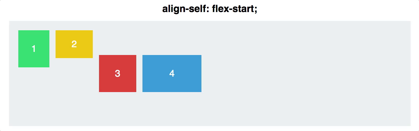
Property # 5 - Align Self
Align-self allows you to manually control the alignment of one particular child element.
Try it out for yourself.
Test it out for yourself in codepen or see how you go with the Flexbox froggy or Flexbox Defence.